Maps, though intended as sources of truth, lie to us all the time. These lies can be intentional or unintentional; lies of omission, or purposeful distortions meant to clarify one element at the expense of another. They can be the result of missing information, like the terra incognita marking unexplored lands on Renaissance maps, or too much information, like the necessary adjustments and abstractions needed when representing a three-dimensional globe on a two-dimensional map.
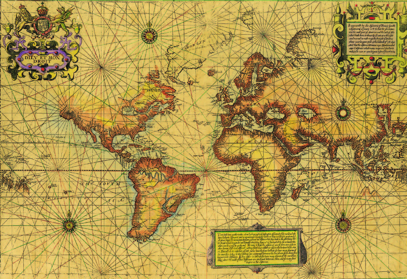
An unexplored North America simply fades away in this Renaissance map (Source: El Palacio, the Magazine of the Museum of New Mexico).
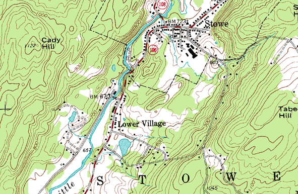
A topographical map representing three-dimensional elevation changes in Stowe, Vermont as two-dimensional contour lines.
Here at Via, we are interested in the factors that drive our choices to omit, add, or modify cartographical information. As discussed in our previous feature on collaborative mapmaking, maps not only inform, but persuade.
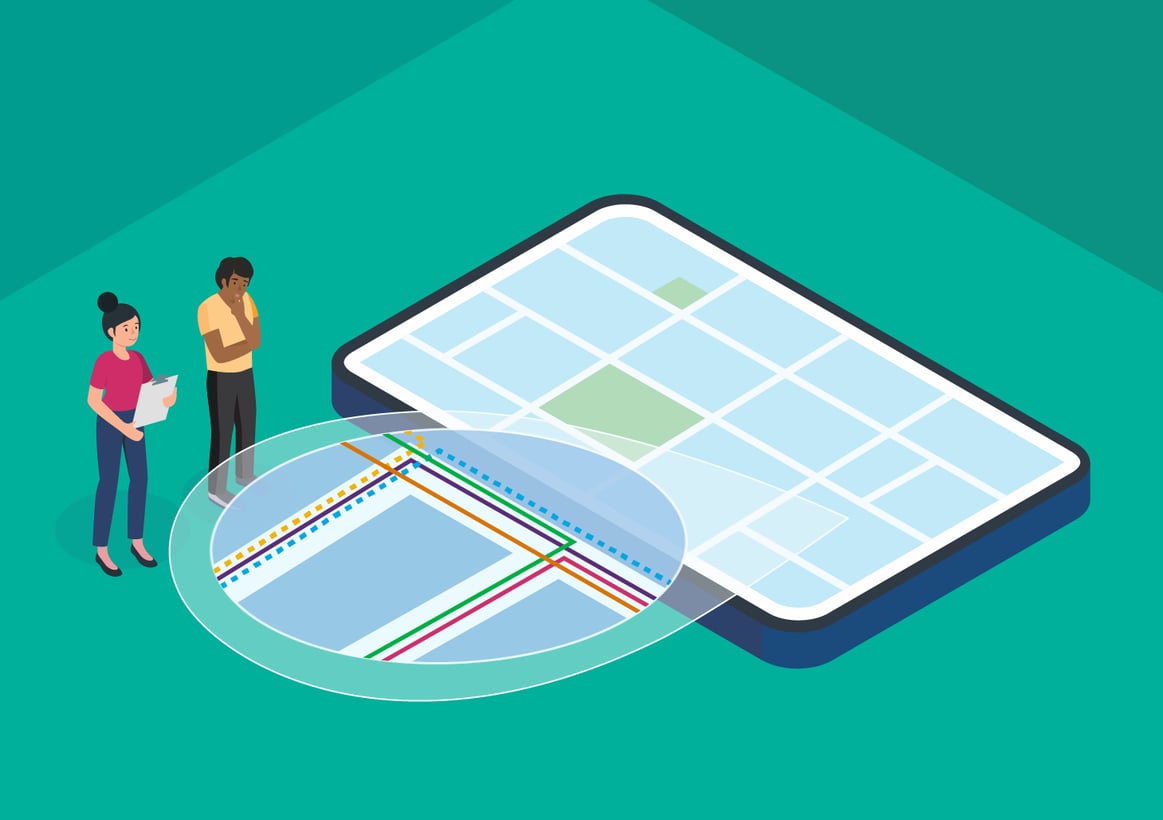
That’s why Via’s planning software, Remix, provides the tools to make the right mapping choices for their purposes — and, just as easily, to foreground those choices, as in Remix Transit’s recent Presentation Studio update. Presentation Studio now allows users to represent transit lines with a convention common to paper transit maps, but previously unavailable in planning software: the representation of overlapping lines as offset from one another. But it also makes this feature a toggle, ensuring that users can choose the mapview that is right for their project at the time. Slide the tool below to see both views:
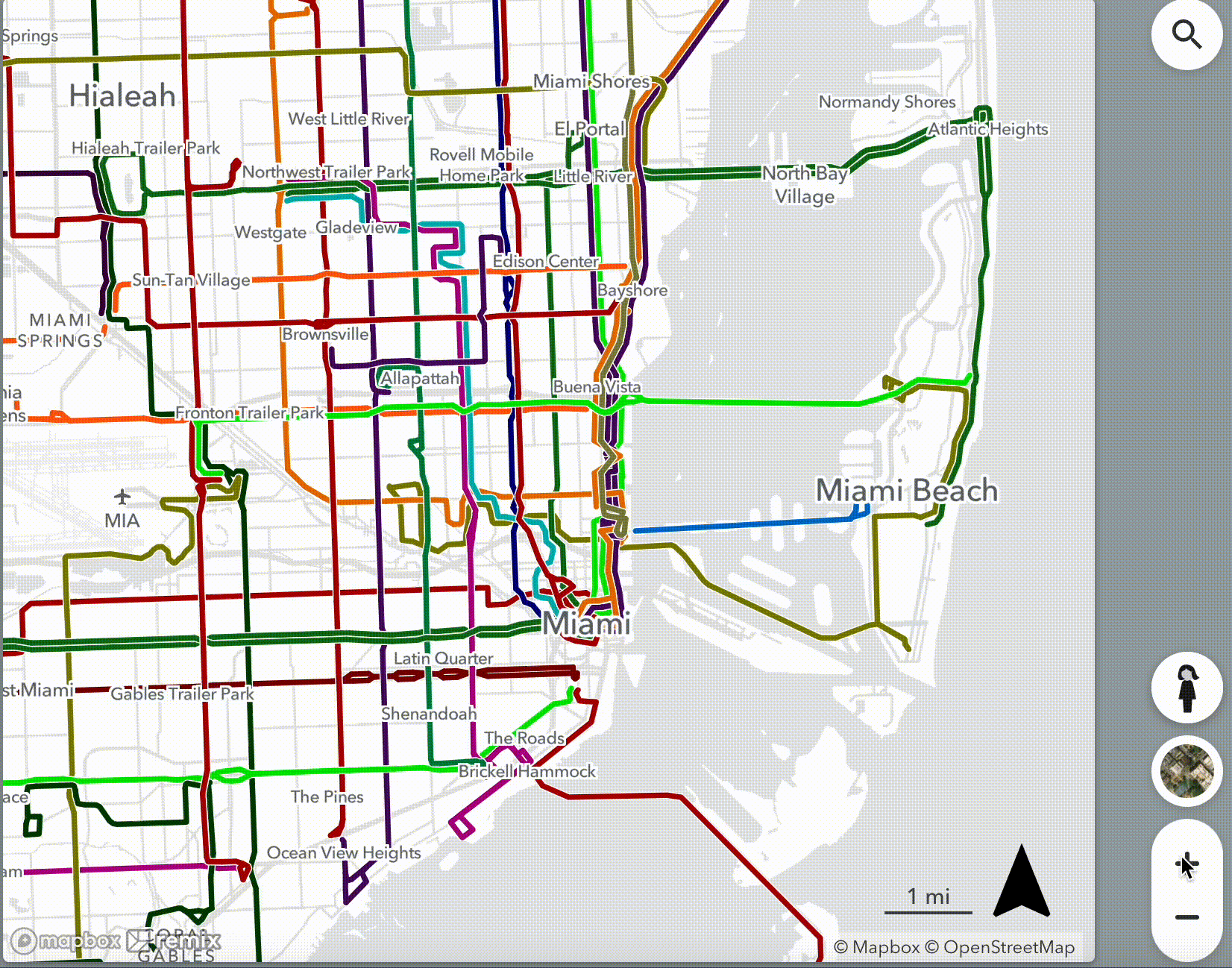
This new feature means users no longer need to use external illustration software to transform the left-hand Miami map into the right-hand one — but it also offers a window into the technical complexity of even the most basic-seeming digital representations. And in turn, this technical complexity reveals the many cartographical decisions that go into the “parallel lines” convention in transit mapping, which highlights certain kinds of information critical to riders and transit planners.
Everyday distortions in the name of legible maps.
Cartographers striving to make good and accurate maps have always had to make compromises for the sake of legibility and utility. The fundamental problem of projecting a three-dimensional globe onto a two-dimensional map cannot be avoided if you want to make a map of the world. The choices available to cartographers do not have to do with whether to distort, but rather what to distort, and how much? Should every map element — be tweaked just a little, or should one element be tweaked a lot?
One of the most famous and familiar world maps, the Mercator projection, swings big with one major distortion: from any point on the map, north is always straight up, south is always straight down, and, as a result, every line of longitude is evenly spaced from the next. This distortion was highly useful to 16th century navigators, who were concerned with circumnavigation, but still forms the base of the “Web Mercator” projection used by most open-source digital mapping tools. The downside, as explained in a memorable West Wing sequence, is that the map is outrageously wrong when it comes to continent sizes: Greenland is depicted as the size of Africa, when in reality it is the size of the Democratic Republic of Congo.
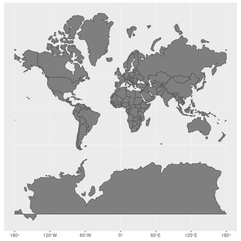
Countries in the northern hemisphere, as well as Antarctica, are massively oversized in the Mercator projection (Source: Jakob Nowosad, Wikimedia Commons).
Distortion in the name of usefulness pervades transit maps as well. The famous London Underground map is a lie — or at least, it is a map that is severely distorted in one way (the actual distance between stations) to maximize utility in another (easy transfers between lines, shown intersecting at pleasing right and 45 degree angles).
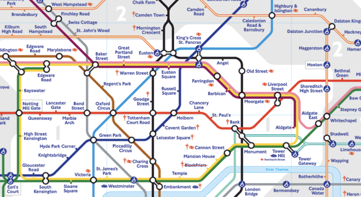
Detail from the London Tube Map (Source: Transport for London), showing central London and emphasizing connections between stations and representing tube lines as largely straight and squared-off.
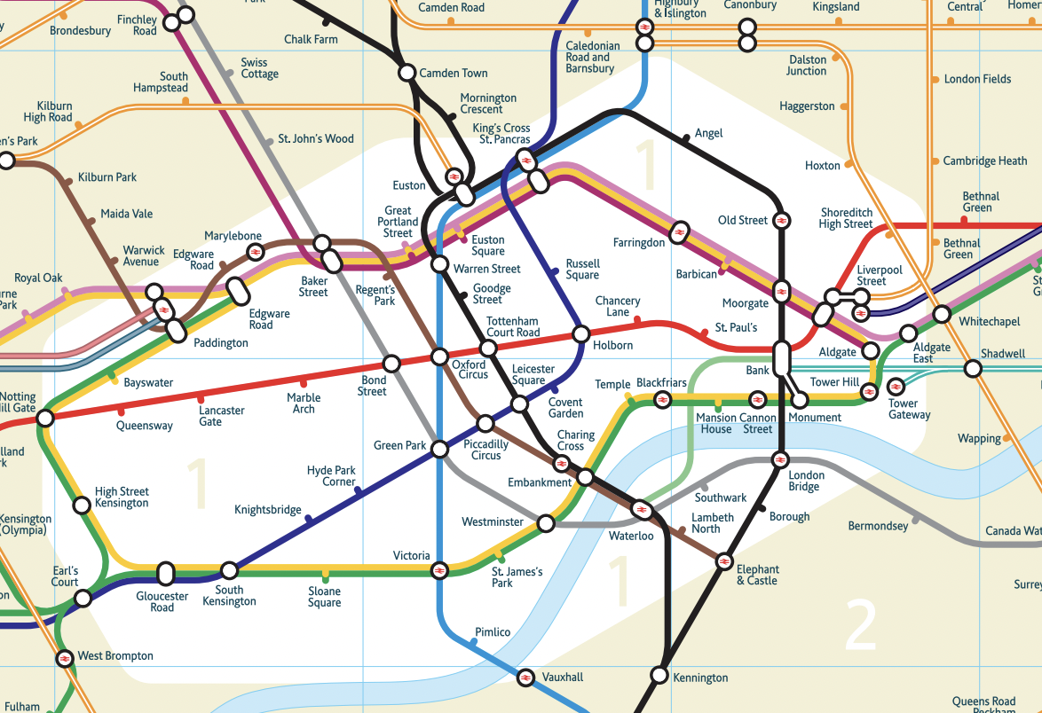
The same area of London represented in a detail from Tubemap Original (source: Mark Noad, london-tubemap.com), a geographically accurate revision of the London Tube Map.
The San Francisco BART map demonstrates how offsetting overlapping lines, though a mapping convention, is nevertheless a choice that communicates some information at the expense of other information. Five underground train lines pass through nine stops in downtown San Francisco. The BART map represents these lines as next to one another, taking up a large proportion of downtown, when in fact the trains travel the same set of tracks and traverse the same Transbay Tube over to Oakland.
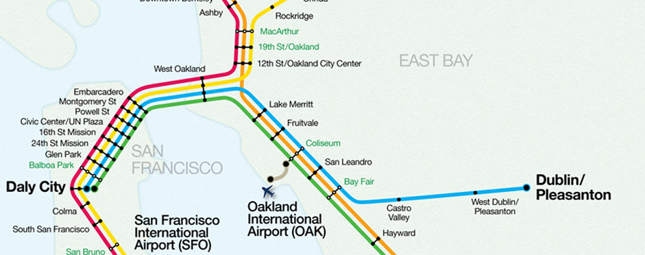 Though extremely distorted geographically, this map nevertheless serves a critical function: it conveys the number of lines that pass through the same stations and, critically, where these lines go afterward, so travelers know which train to get on.
The technical difficulty of parallel lines.
In most planning software, transit lines are shown on top of each other rather than in parallel. This is less a cartographical choice, and more a computational convenience. The computer understands that a bus line travels along a given street; it does not understand, or at least not easily, that a human may wish to see multiple bus lines represented not as traveling precisely along that street but next to each other, even when doing so can introduce inaccuracies in where the buses actually travel. To the computer, the “parallel line” map is inaccurate.
For example, for Remix Transit to operate properly, the underlying algorithms must rely on the exact location of bus routes. If Jane, Remix’s isochrome travel time tool, were set loose on the offset SF BART map, she could cover a much wider swath of San Francisco within 15 minutes of travel than she would in the real-life BART system. 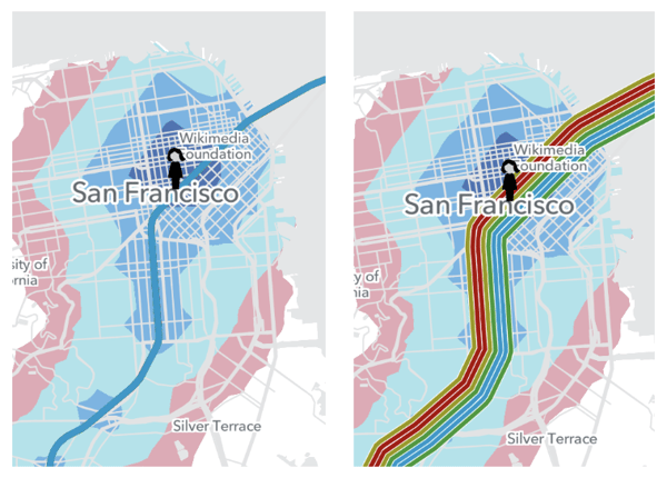 On the left hand map, the dark blue section represents where Jane can travel in 15 minutes from the actual position of the BART lines. On the right hand map, a large proportion of this travel radius is taken up by the offset representation of the BART map.

The only reason for a computer to represent lines in parallel — and this is an extremely important reason — is so the resulting maps can be more easily parsed and shared by human beings. But to the computer, parallel lines are a deliberate fudge factor, no matter how intuitive they may seem to human users. And to make matters worse, this fudge factor is not constant. Parallel transit lines are represented differently depending on the scale of the map, as shown when zooming in below:
So to the computer, it must not simply solve the problem of an acceptable parallel offset once, but many times — whenever a user scrolls or zooms the map.
Introducing: dynamic mapmaking.
Once solved, however, this computational challenge delivers incredible flexibility to transit planners. They can choose the scale at which parallel lines are the most illuminating and the least distorting, depending on the project. And if for a moment they are confused by offset overlapping lines at a knotty intersection and want to know where one line precisely goes — perhaps so they can add or remove a stop, or introduce a detour — they can simply make the rest of the lines invisible by temporarily hiding them.
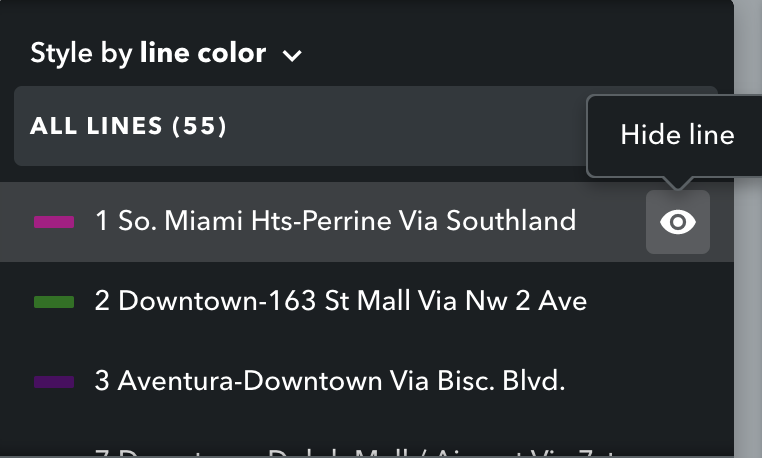
These features of the Presentation Studio — “offset overlapping lines” and “hide line” — allow mapmakers to preserve multiple views of a transit problem within the same tool. With this ability, planners can solicit input on their design and its potential impact on their community, without obscuring the necessary choices that went into representing it in two dimensions.


