A map. It seems like a simple concept, right? You survey an area, take some measurements, mark points of interest, and then put all of that information on paper so people can make plans based on it, understand their surroundings more easily, and move around spaces with confidence.
Well, in practice, this is actually a lot more complicated. The minute you decide to take something ‘living,’ whether it’s a town, a city, or a country, and render it as a static image in a constrained physical space — a piece of paper, a PDF etc. — choices must be made. Will your map show demographic data? What about transit lines and, if yes, which ones? Walking paths? Points of interest? What counts as a ‘point of interest’? Whose ‘interest’ are we even considering?
These are big questions and, when maps are used as a source of truth in order to make transit planning decisions, how these questions are answered becomes critical. A static map freezes the choices and valuations of its makers in place while, at the same time, obscuring those choices, implying objectivity.
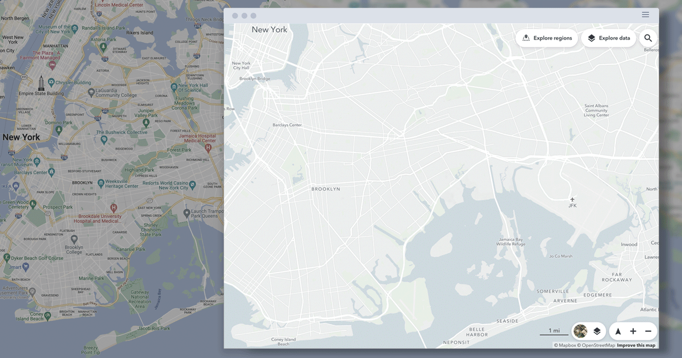
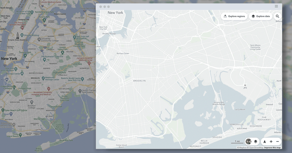 On the left, a static map of Brooklyn. On the right, a map of Brooklyn generated in Remix with multiple available data layers.
Throughout history, we can see examples of these static maps that encode cartographical choices and, thus, reveal their limitations to the time and place in which they were created and the beliefs of those who created them. Looking at maps from the past can give us perspective on how explicitly individual choices and biases can appear in cartography.
From medieval Europe to midcentury New York.
To start, let’s take a look at the Hereford Mappa Mundi — the largest extant medieval map — currently housed in the cathedral of its namesake town, Hereford, England. Like many European maps of its time, the Hereford Mappa Mundi displays Europe and Africa to the left and right, respectively, Asia above both of them, and Jerusalem at the center of the world, with a figure of Christ presiding at the very top.
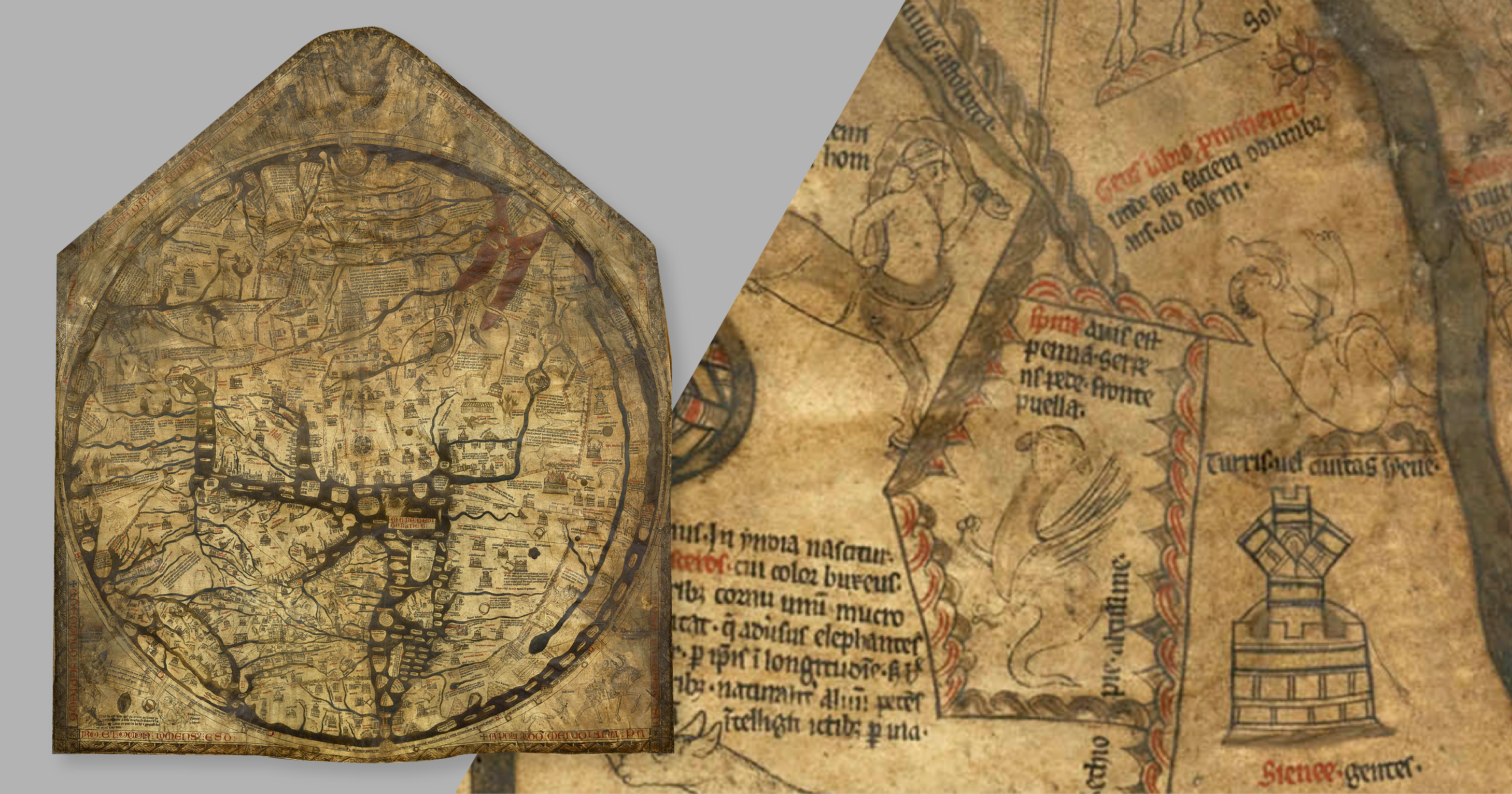
Already, this orientation and the prominence of the figure of Christ signifies the motivations of the mapmaker and, as experts note these kinds of world maps “were probably church decorations celebrating how far Christianity had spread.” The focus is not so much on navigation but, rather, the Catholic Church’s interpretation of humanity and religious point of view. In an age without modern transportation and geographic awareness, these maps gave viewers a taste of what unfamiliar animals and civilizations might look like, with labels describing their key attributes.
In this way, the Hereford Mappa Mundi tells us what was interesting to medieval European mapmakers both through the features it includes and those it omits.
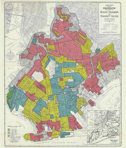
The 1938 Home Owner's Loan Corporation Map of Brooklyn. National Archives and Records Administration.
Some maps, however, don’t simply leave features out, but instead manage to actively exclude populations according to the desires of cartographers. ‘Redlining’, the practice whereby mortgage brokers refused to issue loans to people moving to ‘high-risk’ (read: majority-Black) neighborhoods, is a clear example of historical mapmaking that played an active role in changing countless communities according to the interests of segregationists.
Redlined maps like the one above show ‘desirable’ neighborhoods in green, risky ones in yellow, and high-risk areas in red. But, as noted in the New York Times, “appraisers like the one in Bedford-Stuyvesant weren’t merely identifying disparities that already existed in the 1930s, and that were likely to worsen anyway. The lines they helped draw, based in large part on the belief that the presence of blacks and other minorities would undermine property values, altered what would happen in these communities for years to come. Maps alone didn’t create segregated and unequal cities today. But the role they played was pivotal.”
Most of these ‘high-risk’ areas ended up becoming, or already were, transit deserts — playing a massive role in a lack of jobs’ access for people of color and, therefore, a lack of upwards socioeconomic mobility. For example, today, in a 45-minute transit trip Black New Yorkers have access to 45% fewer jobs on average than white New Yorkers. At the crux of this issue is that maps don’t simply depict what exists, but can perpetuate or, in some cases, even determine what exists. So how does this concept show up in contemporary mapmaking?
Static maps and planning, today.
Picture a group of four or five transportation planning professionals, huddled together around a table, staring at one massive printed map of their community. A creative exercise ensues: pens and pencils start sketching out what could be built, what should be removed, or what can be modified in hopes to build something that is safer, or more equitable, or more protective of the environment. This is what a planning session at most contemporary transit agencies looks like and it bubbles with ambition, expertise, and the desire to find new and exciting ways to offer greater opportunity to the community.
But, despite planners’ best efforts, this creativity is naturally bound by what is physically represented on the maps at hand, and those physically present in the room. What kinds of decisions get made when the printed map only contains government buildings as points of interest, but no grocery stores? What happens when those present are all urban planning M.A.s but no engineers, or vice versa? We can see from the historical examples that when a map is static like this, it adheres to the decisions that were made during its creation. It is stuck in time, stuck in the perspective of the map makers who happened to be in the room.
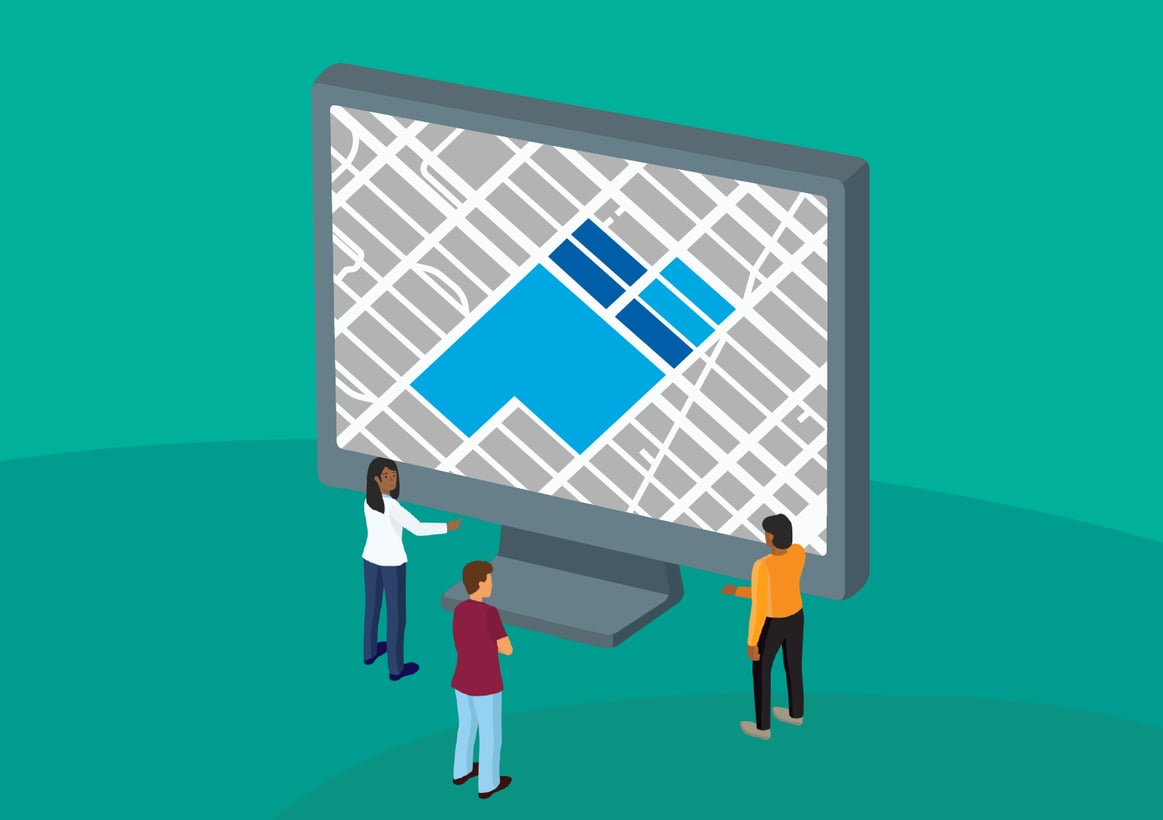
But what’s the alternative? What could replace the kinds of printed maps hung in school classrooms and transit agency walls the world over? The answer lies in what we’ve termed ‘living’ maps, or ones that are interactive. In a living map, you can add or remove data on existing infrastructure and demographics as well as propose, visualize, and evaluate changes to existing systems. These same maps can also measure the impact of certain proposals on accessibility, equity, and efficiency of the overall mobility network, all in one place. A living map is easy to change, easy to share, and malleable, based on new inputs.
Giving life to maps.
Via’s Remix software platform facilitates open dialogue about the choices we’re making when mapping transit, specifically, and avoids freezing those choices in place.
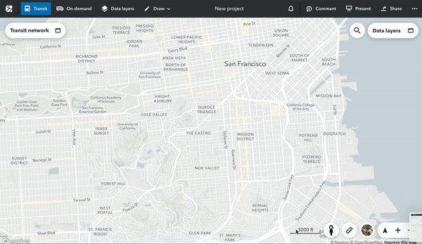
San Francisco, mapped in Remix with multiple data layers.
With Remix, you can always choose another layer to add or a different transit line to focus on, without having to switch screens, rifle through papers or, worse, postpone meetings. Instead, you still have access to all of the data you had previously and you can consult whatever information you need at any time, in order to make the most informed decision. For planners, “living” maps have the following features:
- Democratizing access to spatial analysis. Living maps should not be anchored to the decision of just a few, but reflective of various types of expertise. Remix accomplishes this by democratizing data-driven decision-making. Users from a variety of educational and professional backgrounds can explore spatial data and gather insights easily with Remix. And when spatial analysis is not beholden to the schedule of the GIS expert, decisions are made more quickly and effectively. Jasse Tykkylainen, Data Analyst at Sweden’s Västtrafik agency, calls these capabilities, “a game-changer for us. It allows teams across our organization to self-serve with transportation data and insights at their fingertips in an easy-to-use interface.”
- Facilitating conversation, early and often. Living maps enable smoother collaboration between colleagues. Carlos Cruz-Casas, Assistant Director of Miami-Dade County’s Department of Transportation was able to facilitate an on-the-fly conversation about entertaining microtransit options for their upcoming network redesign. “I sat down next to the Director, drew an on-demand zone to substitute a low-performing fixed route. I was able to show that with the same number of vehicles, we can offer better service, and save resources that could be reallocated into increasing fixed-route frequency on higher demand routes.” Without delay, Cruz-Casas brought a multimodal lens to an executive conversation, enriching the planning process moving forward.
- Expanding the universe of map contributors. Finally, these digital maps are not just more amenable to change: changes can be proposed by governments and the public as well. With commenting and project sharing functionality, users share ideas across both internal and external stakeholders. Clear visualizations help members of the public understand exactly what transportation changes are being considered and how it might affect them, and then they can add comments and have their feedback considered directly alongside feedback from planners themselves. Oxfordshire County Council recently posted their proposal for a road redesign online , using Remix to gather more than 100 comments from the public.
The future of the map is alive.
Fantasy novels commonly open with a detailed map depicting an imagined world, encouraging readers to dream up all of the stories to be told about such a place. These fantastical maps represent discovery and possibility; the same is true for maps of our own world. Whether it’s through more integrated mobility networks that offer greater access to jobs for those in low-income neighborhoods, or a new accessible transit service that gives seniors an affordable option to maintain connections with family and community, a living map is a tool to expand opportunity through data-driven planning and involve many stakeholders in the process. Though static maps by nature impose limitations, living maps offer a way for planners to turn imagined possibilities into a reality.


.png?width=71&height=47&name=Sioux%20Falls%20Webinar%20(6).png)
