Remix’s Jane — a travel-time isochrone that shows how far a person can travel from a specific point within a given time frame — has served an array of purposes for Remix partners. She’s helped planners in Idaho showcase how their network offers freedom of movement to a wide variety of demographics, King County Metro in Seattle gain consensus on their long-range plans, and Pierce Transit in Tacoma get approval to move ahead with BRT.
But here at Remix, one question has been on our minds for a while: when agencies and cities redesign their transit networks and want to compare different scenarios, how can we help them conduct equity analyses across their entire network, rather than from one particular place? We realized we needed a version of Jane that would help users pinpoint accessibility gaps they may be unaware of, so they can begin devising equity-oriented improvements to their systems.
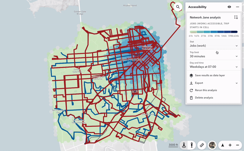
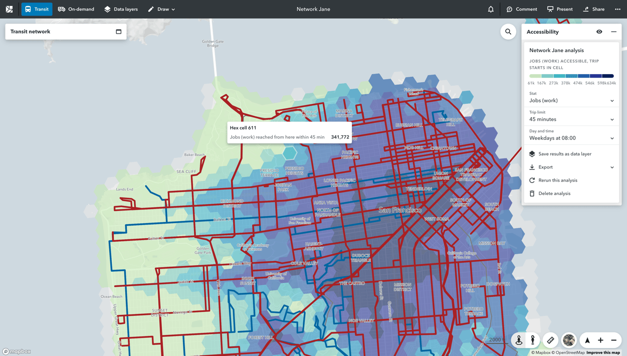
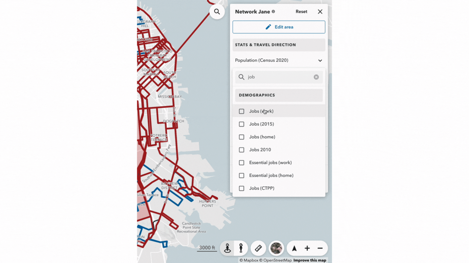
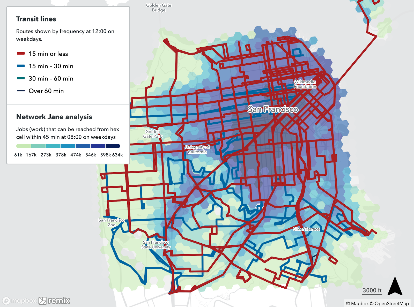
That’s why we created Network Jane. Network Jane shows the results of placing Jane at a multitude of places across your network — not just one. This powerful tool shows you how many jobs, healthcare facilities, and other critical destinations are reachable using your transit network, and by whom. Network Jane answers questions like:
- Which parts of my city have access to the most job opportunities? And which part of the city is falling behind?
- How would upgrading my frequent network from 20-minute to 15-minute headways impact access?
- Are there places in my network with poor access to school, healthcare, or groceries?
- How many low-income residents can access jobs within 20 minutes on weekdays, specifically?
The results will show you which places and communities in those places have the best access to your chosen destinations or opportunities — and which have the worst. Here’s how it works.
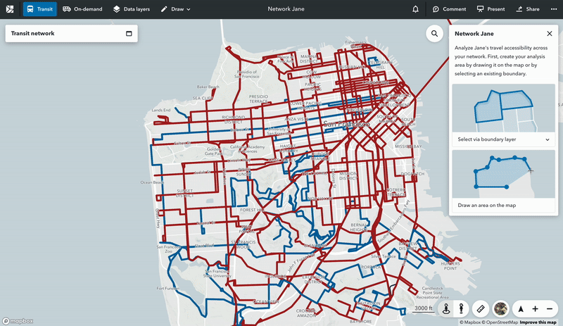
1. Select your area of interest
You can choose to use existing boundaries or draw your own polygon directly on the map in Remix.
2. Build your accessibility query
To what destinations are you interested in analyzing accessibility, and what kinds of trips do you want to evaluate? Choose from a list of statistics representing key destinations and demographic information. You can add as many stats as you like without impacting the time it takes to complete the analysis.
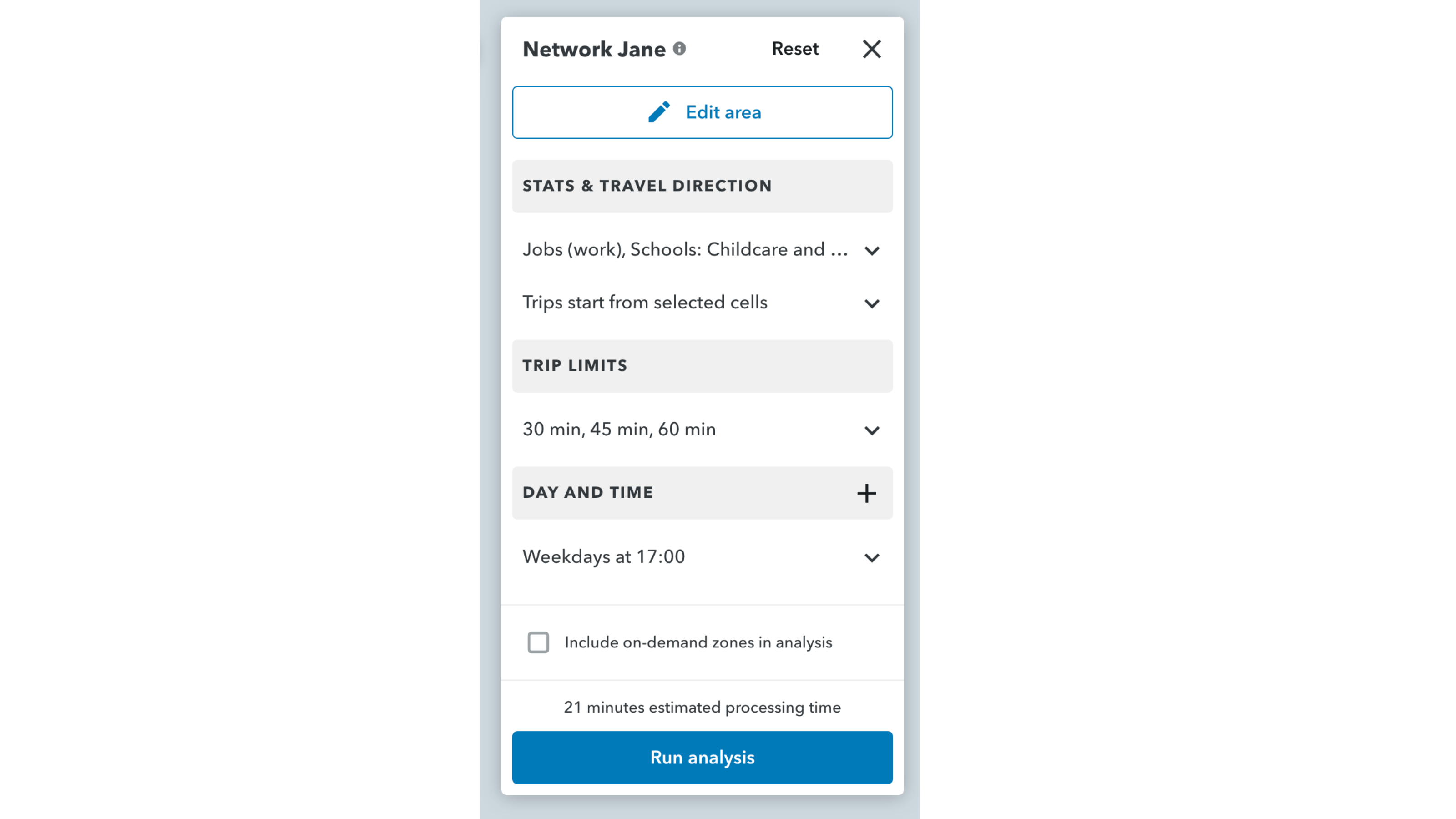
3. Choose a travel direction
By default, Network Jane analyzes travel accessibility from points across your network — this is typically used to analyze access from homes to key destinations. However, you can reverse the travel direction to analyze trips that end in each cell. This allows you to look at your map as destinations rather than starting points for travel. You might use this analysis to look at how many low-income people can reach places across your network.
4. Set trip limits
Customize your analysis to evaluate travel accessibility within specific trip limits (20, 30, 45 minutes, etc.) at specific days and times.
5. Run the analysis and easily bring it to Presentation Studio for a high-resolution, presentation-ready graphic.
From there, we see infinite possibilities — both to make changes that improve accessibility or to offer supporting evidence for plans that improve accessibility in meaningful ways. Here are just a few ideas of how to use Network Jane:
- Initiate analysis for a transit redesign project
- Create beautiful and convincing visuals to present to a city council meeting, perhaps when trying to prioritize funding for particularly underserved areas
- Determine where to add on-demand zones in order to complement an existing fixed-route network.


.png?width=71&height=47&name=Sioux%20Falls%20Webinar%20(6).png)
