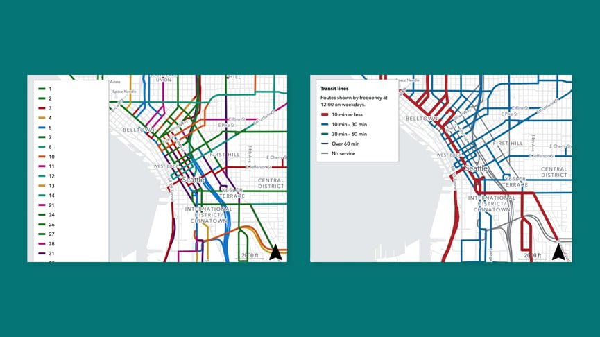
Delivering information to passengers is a critical element of public outreach for transit agencies. That’s why transit agencies publish many route and network maps to communicate service to their riders. While standard maps are great for conveying where transit goes, they are often inadequate at conveying the quality of service. A transit map where all routes are graphically represented equally can be confusing, and at worse, misleading for riders. Riders can easily misinterpret a once-every-hour evening line as receiving the same level of service as a high-frequency trunk line that operates every 5 minutes during commute times.

A frequency map (right) distinguishes itself from a regular network map (left) by providing riders with a sense of how the quality of their region’s transit service impacts their travel experience.
That’s why we are thrilled to announce that frequency mapping is now available in Remix. A frequency map helps you communicate the true quality of your service by stylizing routes by frequency, with high frequency routes displayed as bold red lines, and less frequent routes displayed as thinner blue and green lines. This new functionality helps tell the story of how your network serves your riders during different times of day and on different days of the week.
With just a few clicks, you can transform your map into one that is styled by frequency, vehicle type, or operator type - and specified by time and day. Every transit agency is unique; for some, high frequency means a bus arriving every 5 minutes or less, and for others, a high frequency route operates every 30 minutes, so we provide the ability to customize what “high frequency” means for your agency.
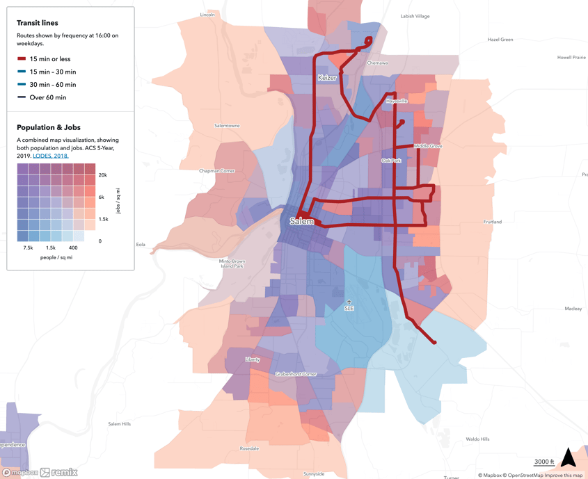
Not only are frequency maps helpful for riders, but they also serve as a critical analytics tool for transit planners. For example, Gavin Pritchard, a transit planner with Jarrett Walker Associates uses Remix’s new frequency mapping feature with Data Layers to understand where there is mismatch between density of activity and high frequency service, and discuss with agencies whether the mismatch is a missed opportunity.

Using Remix’s frequency mapping tool with Remix’s “Population & Jobs” Data Layer elevates insights about mismatches between density of activity and high frequency service.
Frequency maps help transit agencies plan with empathy. As Gavin Pritchard put it: “The frequency mapping tool is my first step in every new Remix map I open. It's a fantastic feature! It’s most important to use frequency maps to help people see the transit network through how the rider actually uses it. A network can look like fifty routes with great access, but if half those routes only come every 2 hours and operate only at certain times in the day, your initial impression of the network is not accurate. It’s all about rider access and frequency maps help unlock that."
The frequency mapping tool is my first step in every new Remix map I open. It's a fantastic feature!
Curious to see Remix's frequency mapping tool in action for your agency? Reach out to us at remix.com/demo and we can show you how it works with your network.

.png?width=71&height=47&name=Sioux%20Falls%20Webinar%20(6).png)


